48 min read
Acre Dashboard Explanation
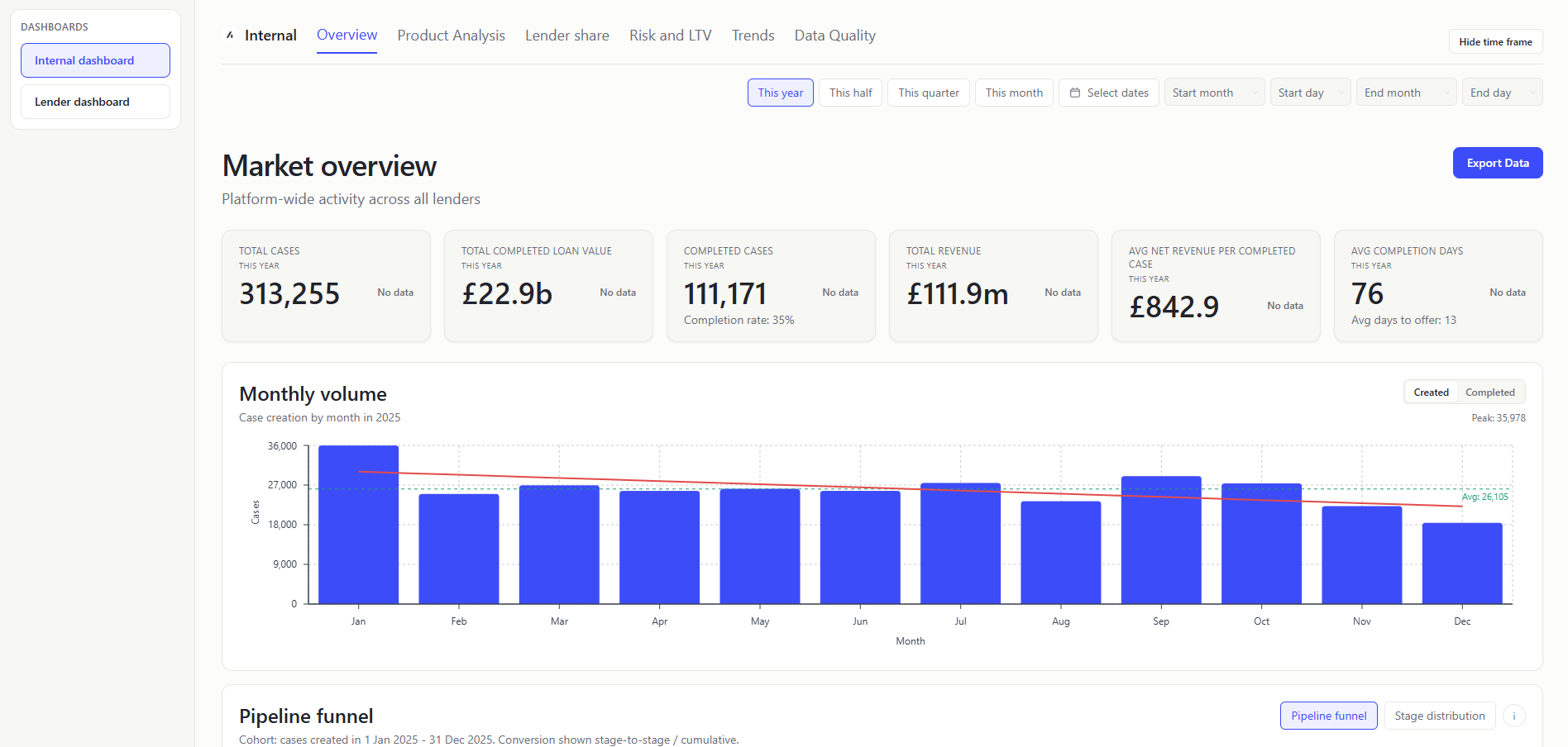
Table of Contents
- Overview
- README Contents
- Shared Calculation Rules
- Repository Structure
- Internal Dashboard
- Lender Dashboard
- Mortgage Data Dictionary
- User Stories
Overview
I treated this exercise as a way of exploring the various optimal graphics for a wide range of metrics and insights that could be derived from the data.
Initial Assumptions
- Two separate dashboards, one for internal users and one for external users:
- Internal users: Acre employees who need to understand the global activity data of lenders.
- External users: Lender partners who need to understand their own performance data.
- External users are not able to see the internal dashboard.
- Built as a screen developed within the context of a wider application.
- No header and footer, nor a proper sidebar for navigation
- No login/authentication feature
- Designed for desktop viewports, with limited scaling between small, medium and large desktop screen sizes
- Assumed that lender partners do not have access to seeing the lender data of other partners within Acre's system.
- Technical stack:
- Built as a Single Page Application (SPA) - ignoring routing for simplicity
- CSV is parsed client-side and mapped into typed domain objects
- Time frames:
- "This half" represents the last 6 months of 2025, "This quarter" represents the last 3 months and "This month" represents the last month. In the production app, these would be dynamic and would be based on the current date.
- Pipeline stage grouping assumptions:
- Stage 1 (Lead):
LEAD- Represents unqualified interest. - Stage 2 (Recommendation):
PRE_RECOMMENDATION,POST_RECOMMENDATION_REVIEW- Groups the adviser's research and advice process. - Stage 3 (Application):
PRE_APPLICATION,REVIEW,APPLICATION_SUBMITTED,REFERRED- Everything from the client agreeing to proceed through to the lender receiving the case. REFERRED sits here because it's still fundamentally an underwriting response to the submission, not a new stage in the client journey. - Stage 4 (Offer):
AWAITING_VALUATION,AWAITING_OFFER,OFFER_RECEIVED- The lender's assessment phase. AWAITING_VALUATION and AWAITING_OFFER are both just waiting states within this phase, and OFFER_RECEIVED is the outcome. Reflects that the client and broker are essentially waiting on the lender throughout. - Stage 5 (Completion):
EXCHANGE,COMPLETE- EXCHANGE and COMPLETE are both conveyancing milestones. They're legally distinct but from a mortgage pipeline perspective they represent the same final phase - the deal is done, it's just a matter of when the keys exchange hands. - Exit stage:
NOT_PROCEEDING- Exit state that can occur at any stage. - System admin states excluded:
IMPORTING,IMPORTED_COMPLETE
- Stage 1 (Lead):
- Data Assumptions
- IMPORTING and IMPORTED_COMPLETE cases are excluded from metrics as I am assuming these are cases in admin processing and need to be completed in their set up in Acre before categorisation
- I limited the LTV bands at 100% - initially misunderstanding that LTVs could be higher than 100%
- The Pipeline Funnel mode and LTV-focused calculation metrics remove any cases with an LTV greater than 1.5
- Blank lender rows are still included in the market average as they are treated as missing data and not excluded from the calculation.
Future Work
- To take this piece of work further, I would do the following:
- Set up some data indicators to help with data quality and validation
- It would then help to exclude certain data to build the most accurate and useful dashboard for the users
- I'd emphasise of ensuring the data is properly populated in the "Data Quality" section
- I'd conduct user interviews with both internal Acre users and Lenders to review the dashboard and gather feedback which key metrics to explore further.
- I'd improve the shared logic of LTV inclusion, ensuring all metrics have the same exclusion logic for LTVs greater than 1.5 after understanding the logic for LTVs higher than 1.
- I'd extend the insights logic, either grouping them onto the Insights tab or distributing banners throughout the dashboard to highlight the insights.
README Contents
Design Decisions and Trade-offs
Why this structure
The structure is designed to answer the highest-value questions for both audiences with minimal friction. For Acre internal users, the priority is a clear market-wide view of volume, funnel progression, and benchmark performance so they can identify platform trends and intervention points quickly. For lender users, the priority is a focused “market vs me” experience that highlights where they over- or under-index against anonymised market baselines.
I prioritised conversion velocity, pipeline progression, and comparative benchmark metrics because they are the strongest practical indicators of operational efficiency and commercial opportunity in mortgage journeys. This also keeps the dashboard decision-oriented: users can move from insight to action (for example, identifying stalled pipeline stages or underperforming segments) without needing raw-data exploration first.
From an implementation perspective, I kept the module as a React + TypeScript SPA embedded within an assumed host application and avoided unnecessary routing/auth complexity for challenge scope. That trade-off improves delivery speed and demo clarity while preserving a path to production hardening (API-backed aggregation, richer navigation, and stronger role/access controls).
Trade-offs
- Client-side parsing is acceptable for challenge scope but would not be ideal at higher production volumes. A real-world solution would involve a backend DB (Postgres/BigQuery) rather than client-side CSV parsing.
- Charting increases bundle size; heavier tab content is lazy/deferred.
- Some benchmark formulas are intentionally simplified for consistency and explainability.
- For this challenge, parsing and aggregation are performed client-side; in production, I would move aggregation to API-backed services and use worker-based parsing/background processing to keep the UI responsive at larger data volumes.
Process
I started the task by using Claude to identify the detail behind each header and ensuring that I had a clear understanding of the data and terminology used. I have a lot of domain knowledge to pick up about the mortgage industry although the terminology quickly became obvious to me as I read through the data.
I then wrote up my assumptions from reading the task, stripping back quite a bit of content to bring the scope of the challenge down to just indicate value add for users rather than including all the typical functionality that would be expected in a real application (login, sidebar, footer, etc). I collated context data such as the task information, job description, screenshots from Acre's website for styling reference and fed these to Claude to research and generate a detailed plan of the task and generate initial mock ups.
I wrote some user stories for the task to help guide the development of the app, looking at the data and understanding the context to generate the stories. I then used Claude to tidy these up and best identify the user names.
I ran the plan in Cursor to generate the initial code for the task, reviewing the output on Thursday evening. I then slept on it and reviewed the output again on Friday morning, first committing to GitHub after some minor UI/layout improvements. I spent Friday afternoon setting up further visualisation charts to add to the dashboard.
I double checked that the dashboard values were correct and aligned with the data in the CSV file by converting the CSV into Excel formula and analysing the data using formulas. I checked the data against the dashboard design on Sunday afternoon and made some minor adjustments to the dashboard to ensure that the data was displayed correctly and optimally.
In a working environment, my behaviour towards regular git pushes would change to include more commits and smaller commits to help with code review and collaboration.
On Monday morning I cleaned up the repo and README.md file and committed the final version to GitHub for submission.
Data Quality
Current handling in this implementation
- Values in CSV monetary fields are interpreted as pence and converted to pounds for display.
- Multiple date/time formats are normalized during parsing to support consistent aggregation and charting. For a production app, I would be working to standardise the data in the database rather than in the application.
- Parse quality and missing-data conditions are surfaced in data quality-oriented UI areas.
- Outlier filtering is applied for some risk views (e.g. very high LTV exclusions) to avoid misleading summaries.
- The "initial_pay_rate" values came in in the format of 454000 which I have assumed to be 4.54% based on realistic rates from the market.
Known data limitations
- Important fields have low population in places (especially lender and mortgage value), which affects confidence for some lender-level metrics.
- Dataset covers 2025 only, so some year-over-year trend cards show no prior-period baseline.
- The market average in lender pages uses selected-period row averages; production logic would require stricter completeness and quality gating.
- In a production app, I would validate the data at ingestion and route missing/invalid data such as missing lender rows to a quarantine stream with reason codes and track blank-lender rate as a data quality SLI with alert thresholds.
- For the Median Days from recommendation to submission, the value I am using is coming out as 0, as sometimes the recommendation_date is after the first_submitted_date so my definition of this needs to be reviewed with better understanding of the process.
Pipeline stage grouping assumptions
To avoid cluttering the dashboard funnel, I added a grouping for case status, listed below. These could be adjusted to better reflect working assumptions in the production app. Statuses are grouped as:
- Stage 1 (Lead):
LEAD - Stage 2 (Recommendation):
PRE_RECOMMENDATION,POST_RECOMMENDATION_REVIEW - Stage 3 (Application):
PRE_APPLICATION,REVIEW,APPLICATION_SUBMITTED,REFERRED - Stage 4 (Offer):
AWAITING_VALUATION,AWAITING_OFFER,OFFER_RECEIVED - Stage 5 (Completion):
EXCHANGE,COMPLETE - Exit stage:
NOT_PROCEEDING - System admin states excluded:
IMPORTING,IMPORTED_COMPLETE
Further Ideation
With additional time, user research would guide feature prioritization before implementation. Adding proper discovery to the process will ensure that the features are actually needed and valuable to the users. However, below I have outlined some possible areas for extension.
Product and UX priorities
- Optimised Overview tabs to show the most important insights first based on user research.
- Optimised data loading between pages to avoid the data being reloaded on every page change.
- Accessibility improvements (ARIA semantics, assistive technology support) are identified as a next-step focus area.
- Performance and polish improvements would target loading behavior (adding skeletons), tooltips, micro-interactions, and navigation smoothness.
Potential feature extensions
- Additional filtering across case type/status and other dimensions for deeper investigative workflows.
- More granular export options by chart/table/page instead of only broad exports.
- With more time, I would also consider adding extra pipeline analysis, investigating more cases stuck in the pipeline at certain stages to understand why and what can be done to improve the process. For this demo, I have added a few insights to the lender dashboard for cases stalled at submitted to give a feel for the type of analysis that could be done.
- If it was known that a lenders entire mortgage case profile was stored on Acre, we could add additional information such as how much total loan value they are committed to.
Data and modelling enhancements desired
- Better upstream data completeness and quality controls for key attributes. I began mocking up some data checking functionality in a local Excel file (e.g. if a case is at "PRE_RECOMMENDATION", check that the data has a mortgage value and LTV value), but considered the full implementation out of scope for this challenge.
- Visibility of case status immediately prior to
NOT_PROCEEDINGto improve root-cause analysis. Without this, it can be difficult to understand from the data where the case was lost for further analysis. - Lookup enrichment for organisation, advisor, and case manager to unlock user-personalized analytics.
- Currently, the market average used on the Lender dashboard is the average of all rows of the data in the selected period. In a production app, I would use a more sophisticated approach to calculate the market average based on checked and completed data after deeper interrogation of the incomplete data rows.
Shared Calculation Rules
- Period scoping: Unless explicitly stated otherwise, dashboard metrics are computed from
periodData, where rows are filtered bycreatedAtwithin the selected period. - System-state handling: Many denominator-based rates exclude system statuses (
IMPORTING,IMPORTED_COMPLETE) viatoPipelineStage/isSystemCaseStatus; those rows are not counted as funnel stages. - Date anchors: Several stall/age metrics use a fixed as-of date (
2025-12-31) in current implementation, while funnel in-flight warning logic usestodaywithtypicalLifecycleDays. - Value guards: Revenue and mortgage-value sums usually clamp null/negative values to zero; averages typically exclude null values.
- LTV guards: Risk metrics generally treat valid LTV as
0 <= ltv <= 1.5, and some funnel/cohort metrics explicitly exclude rows withltv > 1.5.
Repository Structure
Top-level directories and purpose
src/: Application code (React UI, state wiring, business logic helpers, and types).public/: Static assets loaded directly by the app, including the CSV data source used in this challenge.dist/: Production build output generated by Vite- Root config files (
package.json,tsconfig*,vite.config.ts, lint/tailwind/postcss configs): Tooling and build/runtime conventions
src/ split by dashboard domain
components/internal/: Internal (Acre-side) dashboard tabs and cards.components/lender/: Lender-facing dashboard tabs and cards.components/shared/: Reusable primitives shared by both audiences (KPI cards, filters, shared funnel components, chart wrappers).components/shell/: Application shell and navigation orchestration (AppShell) that composes views/tabs and lazy-loads tab content.- Why this split exists: It keeps audience-specific behaviour separate while preserving shared UI/interaction consistency across both dashboards.
Data, state, and metric computation layers
context/(undersrc): Global app data context (DataProvider) that exposes load status, active period, selected lender, and period model.hooks/: Data loading lifecycle (useDataLoader) so async parse/filter flow is isolated from presentation components.utils/: Centralized parsing, normalization, aggregation, and metric helpers (csvParser,aggregations,funnelMetrics,lenderInsights).types/: Shared TypeScript contracts (MortgageCase, period/metric models) used across UI and utility layers.- Why this split exists: Components stay focused on rendering and interaction while calculation logic remains testable, reusable, and consistent between tabs.
Testing layout and rationale
- Shared test support and smoke coverage (
src/test/): Reusable fixtures/setup plus cross-feature smoke tests for high-risk shared components. Utility-level tests - Formula and aggregation correctness checks where most business risk lives.
Why the repo is structured this way overall
- Audience boundary first: Internal and lender journeys are separated by folder to reduce accidental coupling and privacy-risky cross-use of data views.
- Shared building blocks second: Common controls/components/metrics are centralized so both dashboards remain visually and behaviourally aligned.
- Change safety third: Tab-level code lives in focused modules and is lazy-loaded by the shell, lowering blast radius for incremental feature updates.
Internal Dashboard
Overview

The Overview screen gives internal users a fast view of platform activity volume and seasonality.
TOTAL CASES (KPI Card)
- What it shows: Total number of case records created in the selected period (
stats.totalCases). Count of rows after period filtering. - Value to user: Internal teams get a fast view of platform activity volume.
TOTAL COMPLETED LOAN VALUE (KPI Card)
- What it shows: Sum of
mortgageAmountfor cases in completion statuses (EXCHANGEorCOMPLETE). Filter completed-status rows and sum positive mortgage amounts. - Value to user: Internal teams can track delivered lending value, not just case count.
COMPLETED CASES (KPI Card)
- What it shows: Count of cases mapped to pipeline stage
COMPLETION(EXCHANGEorCOMPLETE). Calculated:toPipelineStage(caseStatus) === 'COMPLETION'count. - Supporting metric shown under value:
Completion rate: X%, whereX = completedCases / totalCasesfor the selected period. - Value to user: Internal teams can monitor conversion outcomes at the end of funnel.
TOTAL REVENUE (KPI Card)
- What it shows: Sum of
totalCaseRevenuefor all rows in period. Add each row's revenue value (total_case_revenue). - Value to user: Internal teams can tie operational activity to commercial outcome.
AVG NET REVENUE PER COMPLETED CASE (KPI Card)
- What it shows: Mean
netCaseRevenueacross successfully completed cases. Sumnet_case_revenuefor completion-stage casesCOMPLETION(EXCHANGEorCOMPLETE) / completed-case count. - Value to user: Internal teams can compare efficiency and quality of converted business.
AVG COMPLETION DAYS (KPI Card)
- What it shows: Mean days from
firstSubmittedDatetocompletionDate(Typical time it takes to complete a case after submission). Average calendar-day difference across valid submitted+completed rows. - Supporting metric shown under value:
Avg days to offeris the average difference offirstSubmittedDatetofirstOfferDate. - Value to user: Internal users can detect operational slowdowns affecting broker/lender experience.
DAILY/MONTHLY VOLUME CHART (Chart)
- What it shows: Time-series of case created/completed volume with computed linear trend line. Count of cases created/completed by day/month.
- Value to user: Internal users can identify momentum shifts and cyclicality quickly.
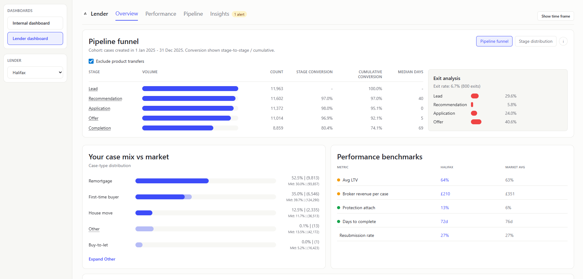
PIPELINE FUNNEL (Chart)
- What it shows: Cohort conversion/timing/exit analysis. How a created-in-period cohort progresses through the journey.
- How
Pipeline funnelis calculated:- Build cohort from
createdAtin selected period. - Exclude
IMPORTING/IMPORTED_COMPLETEandltv > 1.5. - Optionally exclude PT (
pt = true, default ON). - Count milestone reach (
recommendationDate,firstSubmittedDate,firstOfferDate,completionDate). - Compute:
stageConversion = stageCount / previousStageCountcumulativeConversion = stageCount / cohortCount
- Compute
medianDaysFromPrevfor each transition after Lead.
- Build cohort from
The median days is 0 for Application because the recommendation_date is after the first_submitted_date so my definition of this needs to be reviewed with better understanding of the process.
- Exit analysis : Shows a split of what stage the cases exited at. So 89.4% of the cases exited at Lead, where they had a createdAt date, but then were either marked as NOT_PROCEEDING or had a notProceedingDate before they had a recommendationDate.
exitRate = exitedCases / cohortCount- exited-at-stage distribution based on furthest reached milestone before exit.
- How exits are identified:
exitedCasesare cohort rows wherenotProceedingDateexists orcaseStatus === NOT_PROCEEDING. - How exited-at-stage is assigned: For each exited row, evaluate milestone dates in order (
createdAt,recommendationDate,firstSubmittedDate,firstOfferDate,completionDate) and take the furthest milestone date that is on/beforenotProceedingDate(or furthest available milestone when no explicit exit date exists). Map that index to pipeline stage and increment that stage bucket. - How breakdown percentages are calculated:
stageExitShare = exitedAtStageCount / exitedCases(denominator is exited rows, not full cohort).
- In-flight warning : Shows when selected range end is too recent relative to typical lifecycle; warns that completion may be artificially low.
- PT toggle rationale: PT journeys may skip normal progression stages; excluding them improves comparability of standard pipeline conversion metrics.
- Value to user: Internal users can separate throughput issues (timing), conversion leakage (stage/cumulative rates), and attrition concentration (exit stage mix) in one panel.
STAGE DISTRIBUTION (Chart)
- What it shows: Distribution of cases by pipeline stage. Group by pipeline stage and show
shareOfTotal = stageCount / totalEligibleCases. - Value to user: Internal users can see the distribution of cases by pipeline stage.
CASES BY TYPE (Chart)
- What it shows: Distribution of cases by normalized case type. Group by case type and divide each count by total cases.
- Value to user: Internal teams can align product/ops focus to dominant case segments.
MARKET SHARE (COMPLETED CASES) (Chart)
- What it shows: Per-lender share of completed-case volume. Which lenders are winning the most completions. Count completed cases per lender / total completed cases.
- Value to user: Internal teams can track concentration and partner performance dynamics.
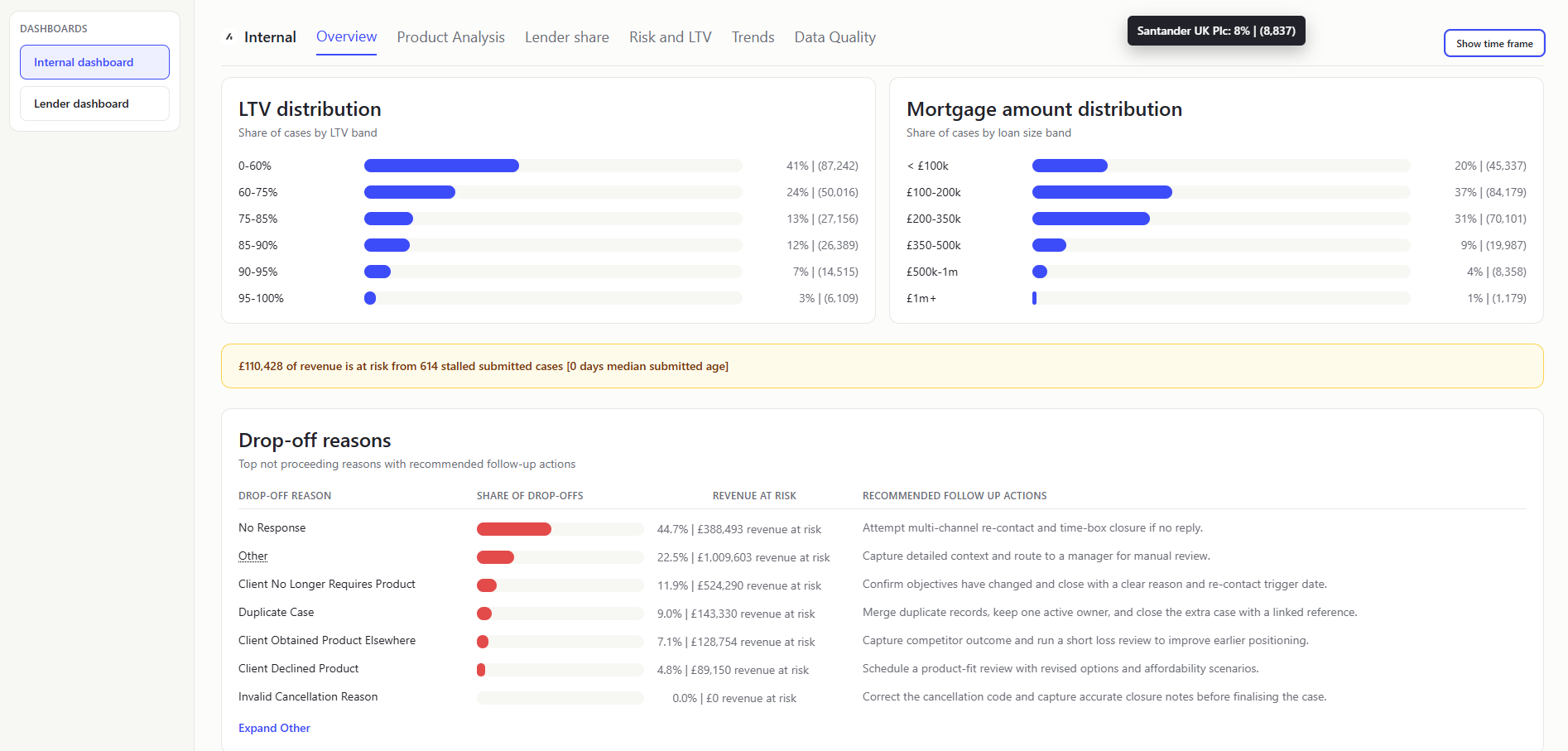
LTV DISTRIBUTION (Chart)
- What it shows: Share of cases per LTV band. How much business sits in low vs high leverage ranges. Bucket valid LTV values into configured bands and normalize by total.
- Value to user: Internal users get a portfolio risk profile at a glance.
I limited the LTV bands at 100% - initially misunderstanding that LTVs could be higher than 100%
MORTGAGE AMOUNT DISTRIBUTION (Chart)
- What it shows: Share of cases by mortgage-amount bands. Shows whether business is weighted toward smaller or larger loans. Bucket mortgage amounts into predefined ranges and normalize.
- Value to user: Internal users can monitor value mix and potential revenue implications.
REVENUE-AT-RISK HEADLINE (Banner)
- What it shows: Single platform-level headline for broker revenue tied to stalled submitted cases. "How much revenue is currently at risk if stalled cases do not progress." Identify application-stage cases above the platform submitted-age median (calendar-day diff between firstSubmittedDate and recommendationDate), then sum
totalCaseRevenueacross that stalled subset. - Value to user: Internal users get an immediate commercial-risk signal before drilling into detailed tabs.
The stalled cases are identified as calendar-day diff between firstSubmittedDate and recommendationDate. This is then showing as 0 as some of the cases have a recommendationDate after the firstSubmittedDate, presumably as the recommendation date field was re-updated.
DROP-OFF REASONS (Table)
- What it shows: Ranked reasons from
NOT_PROCEEDINGcases, plus linked volume/value (total_case_revenue). Filter not-proceeding rows, group by reason, sort by count. - Value to user: Internal teams can prioritize root-cause fixes where loss impact is highest.
Product Analysis

AVG TERM LENGTH (KPI Card)
- What it shows: Average term length for period rows, displayed in years. Parse and normalize
termvalues to a consistent basis, then compute mean term and present in years. - Value to user: Internal teams can quickly monitor shifts in product duration profile.
REGULATED CASES (KPI Card)
- What it shows: Count and share of period cases where
regulatedis true. How much of platform flow falls under regulated-case scope.regulated case count / total period cases, shown as both absolute count and percentage. - Value to user: Internal teams get an immediate compliance-composition signal.
COMPLETED CASES WITH LINKED PROTECTION (KPI Card)
- What it shows: Number and share of completion-stage cases where
linkedProtectionis true. How many completed cases also attached protection products. Filter completion-stage rows, countlinkedProtection = true, and divide by completed-case total for the subtitle percentage. - Value to user: Internal teams can track protection attach outcomes on completed business.
HIGHEST AVG NET REVENUE CASE TYPE (KPI Card)
- What it shows: Case type with the highest average net revenue in the period (excluding
Other). Compute average net revenue by case type, excludeOther, and select the highest valid value. - Value to user: Internal teams can identify the most commercially efficient case segment at a glance.
INITIAL RATE TYPE SHARE (Chart)
- What it shows: Distribution of period cases across normalized initial-rate types. Group period rows by normalized
initialRateType. Excludes blank values. - Value to user: Internal teams can track product appetite shifts that affect pricing and risk.
CASE COMPOSITION (Panel)
- What it shows: Four mini-stat tiles for key composition flags: PT, Consumer BTL, Further advance, Porting. How common each specialist case category is in current period flow. For each flag, count rows where the flag is true and divide by total period cases for percentage.
- Value to user: Internal teams can quickly monitor portfolio mix dimensions used in policy and operational planning.
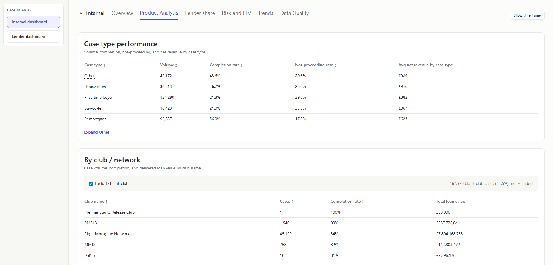
CASE TYPE PERFORMANCE (Table)
- What it shows: Per-case-type performance rows with volume, completion rate, not-proceeding rate, and average net revenue. In plain terms: Which case types are converting best, leaking most, and generating strongest average revenue.
- How it is calculated: Group period-filtered rows by normalized case type, then compute:
Volume = row countCompletion rate = completed count / volumeNot-proceeding rate = not-proceeding count / non-system rows for that case typeAvg net revenue by case type = sum(net revenue) / volume for that case type
- Value to user: Internal teams can compare quality and commercial output across product segments in one place.
BY CLUB / NETWORK (Table)
- What it shows: Which clubs/networks contribute the most cases and strongest completion outcomes.
- How it is calculated: Group period rows by normalized
clubName, then compute:Cases = row countCompletion rate = completed count / casesTotal loan value = sum(mortgageAmount for completed cases)
- Value to user: Internal teams can compare distributor performance and concentration across club/network channels.
Lender Share
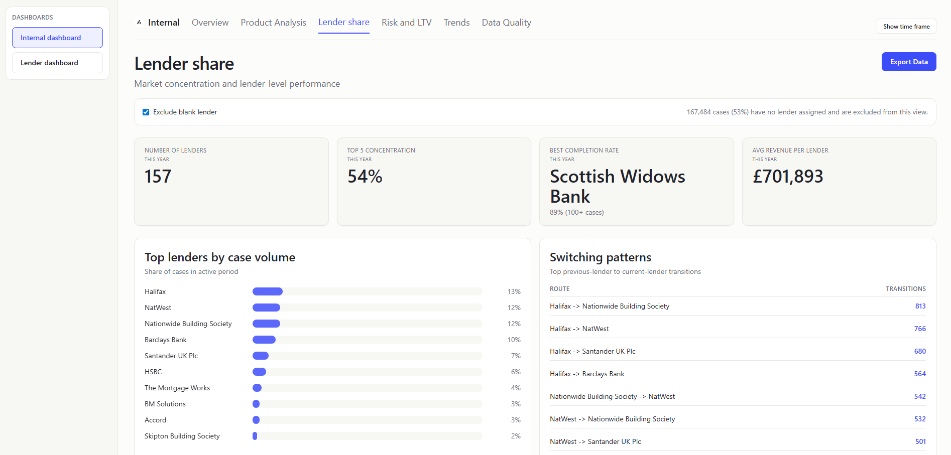
NUMBER OF LENDERS (KPI Card)
- What it shows: Distinct lender count in filtered period (with optional blank-lender exclusion). How many lenders are active in this period.
- Value to user: Internal teams can monitor marketplace breadth and partner participation.
TOP 5 CONCENTRATION (KPI Card)
- What it shows: Sum of case-share percentages for the top 5 lenders by case count volume. How much market control sits with the five biggest lenders. Rank lenders by case count, then add shares for top five.
- Value to user: Internal teams can measure concentration risk and diversification health.
BEST COMPLETION RATE (KPI Card)
- What it shows: Highest lender completion rate among lenders above minimum volume threshold. Completion rate per lender = completed cases / total lender cases; take max where lender case count is
>=100. - Display : KPI subtitle includes the winning rate and the eligibility rule (
100+ cases) to make the volume guardrail explicit. - Value to user: Internal users can benchmark what "good" performance looks like.
AVG REVENUE PER LENDER (KPI Card)
- What it shows: Typical revenue generated by each lender in this period. Sum valid
totalCaseRevenuevalues across filtered rows and divide by number of active lenders. - Value to user: Internal teams can compare concentration and lender productivity in one KPI strip.
TOP LENDERS BY CASE VOLUME (Chart)
- What it shows: Ranked distribution chart of top lenders by case share. Which lenders drive most case volume. Count cases per lender, convert to share of period total, rank top N.
- Value to user: Internal teams can identify major contributors and dependency risk.
SWITCHING PATTERNS (Table)
- What it shows: Transition counts from
prevLenderto current lender for changed-lender cases. In plain terms: Where cases move from and to between lenders. - Value to user: Internal users can detect competitive pressure and retention leakage.
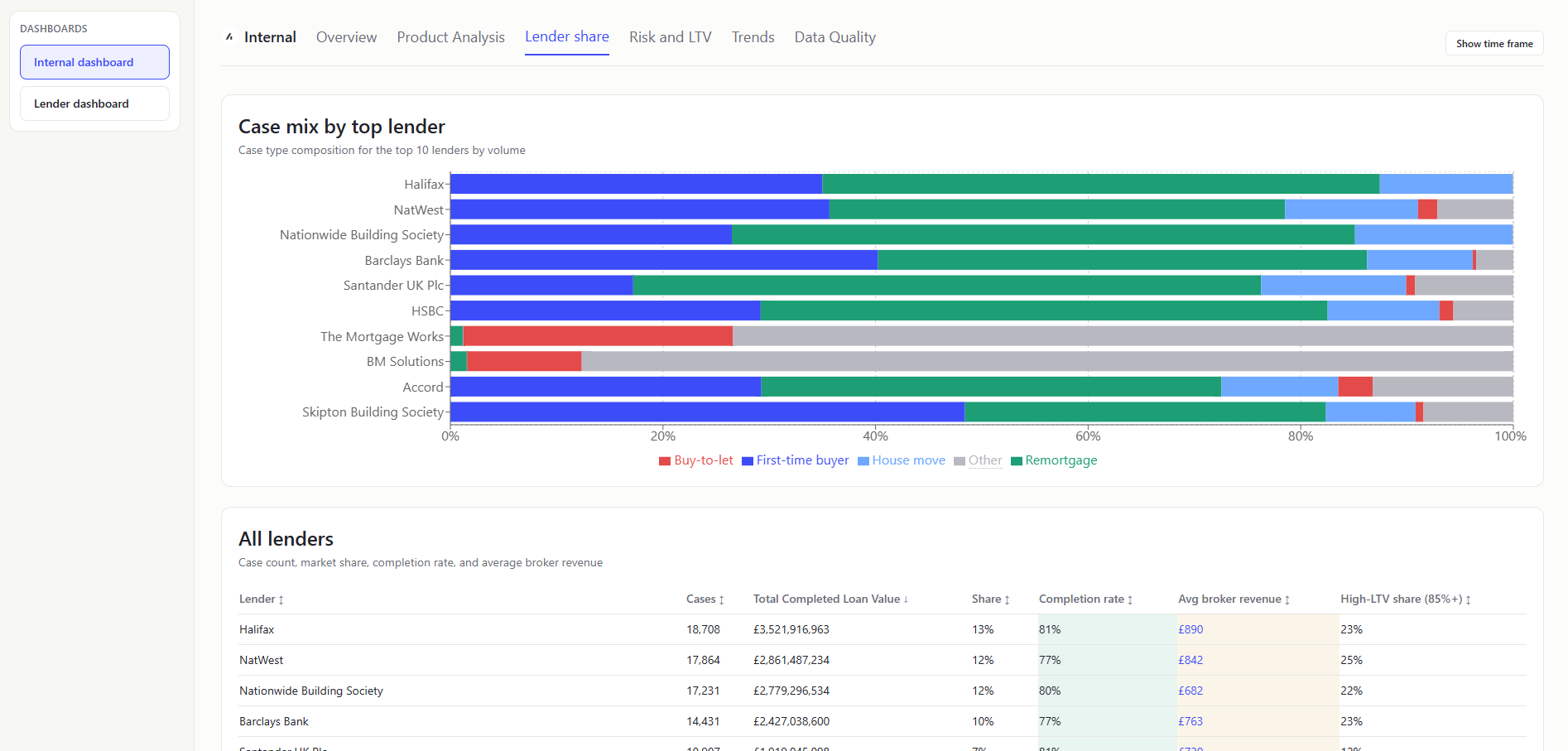
CASE MIX BY TOP LENDER (Chart)
- What it shows: Stacked case-type composition for leading lenders by case volume. Which lenders are strong in which business types.
- Value to user: Internal teams can align partner strategy with segment-specific strength.
ALL LENDERS TABLE (Table)
- What it shows: Per-lender metrics: Detailed scorecard to compare lenders on volume, quality, and risk. Colour coded cells show if value is above or below the mean for that metric.
LTVvalues over 1.5 are excluded. - Value to user: Internal teams can identify underperformers and outliers quickly.
Risk and LTV
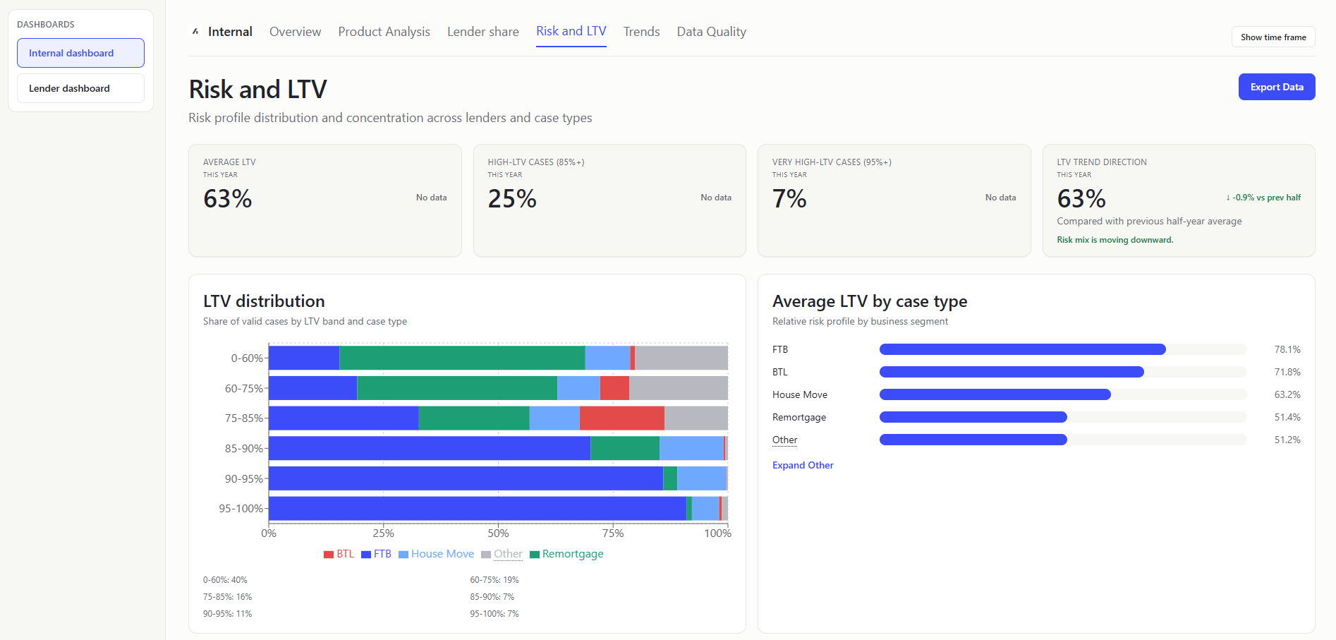
AVERAGE LTV (KPI Card)
- What it shows: Typical leverage level across current business. Average LTV values where LTV is non-null and within accepted bounds (less than 1.5).
- Value to user: Internal teams monitor overall risk appetite in platform flow.
HIGH-LTV CASES (85%+) (KPI Card)
- What it shows: Share of cases in higher-risk leverage range. Count high-LTV rows / total valid-LTV rows (less than 1.5).
- Value to user: Internal users can quickly track risk pressure in incoming pipeline.
VERY HIGH-LTV CASES (95%+) (KPI Card)
- What it shows: Share of cases at very high leverage. Count very-high-LTV rows / total valid-LTV rows (less than 1.5).
- Value to user: Internal teams can monitor tail risk and product suitability exposure.
LTV TREND DIRECTION (KPI Card)
- What it shows: Difference in average LTV between earlier and later period segments. Whether leverage is trending up or down. Shows the first half of the selected period compared to the second half of the selected period.
- Value to user: Internal users can detect drifting risk profile before losses materialize.
LTV DISTRIBUTION (STACKED) (Chart)
- What it shows: LTV-band totals plus case-type stacking in each band. Bucket valid LTV rows into configured bands, then split each band by case-type counts (with the final 95%+ band carrying all values above 95% up to the 1.5 LTV cap).
- Value to user: Internal teams can connect segment mix to risk concentration.
The LTV band for 95-100% includes all values above 95% up to the 1.5 LTV cap.
AVERAGE LTV BY CASE TYPE (Chart)
- What it shows: Mean LTV per normalized case type. Which business segments are riskier on leverage.
- Value to user: Internal users can tune segment-specific guidance and partner discussions.
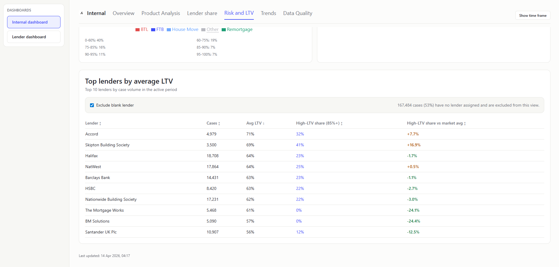
TOP LENDERS BY AVERAGE LTV (Table)
- What it shows: Top-volume lenders ranked with avg LTV, high-LTV share (includes LTVs up to 1.5), and high-LTV share delta vs market average. Which major lenders carry higher-leverage books and who over-indexes against market.
- Value to user: Internal teams can target risk reviews where exposure is concentrated.
Trends
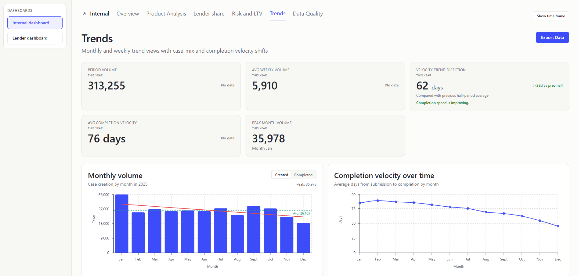
PERIOD VOLUME (KPI Card)
- What it shows: Overall number of cases in scope.
- Value to user: Internal teams get baseline scale for all other trend metrics.
AVG WEEKLY VOLUME (KPI Card)
- What it shows: Mean case count across weekly buckets. Typical weekly case creation-rate.
- Value to user: Internal users can set realistic throughput expectations.
VELOCITY TREND DIRECTION (KPI Card)
- What it shows: How completion speed (
firstSubmittedDatetocompletionDate) changed between the first half and second half of the selected period. Difference in average completion days between earlier and later half-period windows. Whether completion speed is improving or slowing. - Value to user: Internal teams can quickly judge directional movement without scanning the full line chart.
AVG COMPLETION VELOCITY (KPI Card)
- What it shows: Case-weighted average completion days from submission to completion (
firstSubmittedDatetocompletionDate). Average day difference across all valid submitted+completed rows in the selected period. - Value to user: Internal teams can detect operational drag impacting outcomes.
The average completion velocity is the average of the completion days for all valid submitted+completed rows in the full selected period. The velocity trend direction is the difference in average completion days between the first half and second half of the selected period.
PEAK MONTH VOLUME (KPI Card)
- What it shows: Maximum monthly case count and month label. Busiest month for case creation in the selected range.
- Value to user: Internal users can identify peak load periods for planning.
MONTHLY VOLUME CHART (Chart)
- What it shows: The monthly trajectory of demand, with a switch between created and completed case views.
- Value to user: Internal teams can validate growth/decline narratives with data.
COMPLETION VELOCITY OVER TIME (Chart)
- What it shows: Line chart of monthly average completion days from submission to completion (
firstSubmittedDatetocompletionDate). Whether completion speed is improving or worsening by month. - How it is calculated: Per-month average days from submitted to completed cases.
- Value to user: Internal users can measure impact of process improvements over time.
Later months have many in-flight cases; only the quickest cases have completed yet, which pulls averages down.
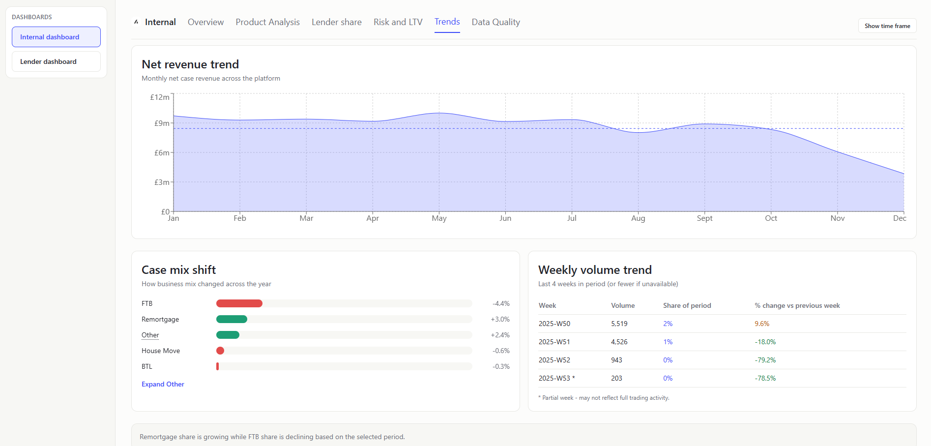
NET REVENUE TREND (Chart)
- What it shows: How net revenue changes month to month and against normal level. Aggregate monthly
netCaseRevenue. Average line = mean monthly total. - Value to user: Internal teams can detect commercial momentum and weak months.
Grouping by created month means revenue is attributed to when cases were created, not when commercially realized; later months may include more immature, lower-realized cases.
Data completeness lag (newer months often have less complete financial fields).
CASE MIX SHIFT (Chart)
- What it shows: How business composition changed across the year. Sort by
createdAt, split rows at the midpoint index, and compare type percentages between first and second halves. - Value to user: Internal teams can separate volume changes from mix-driven changes.
WEEKLY VOLUME TREND TABLE (Table)
- What it shows: Last 4 weekly counts, share of period volume, and week-on-week percentage change. Weekly grouping, keep final four weeks in period, share = weekly count / total period volume, and WoW % =
(current - previous) / previouswith safe null handling. - Value to user: Internal users can spot short-term surges and dips.
Data Quality
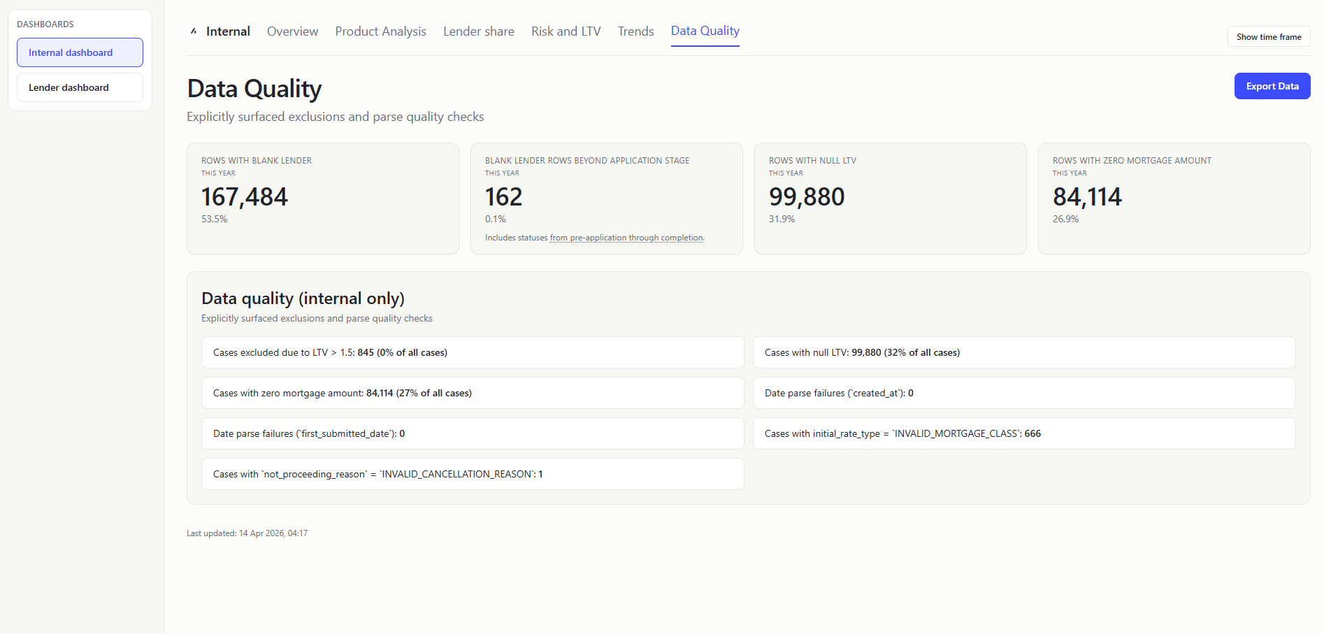
ROWS WITH BLANK LENDER (KPI Card)
- What it shows: Count and share of rows where lender is blank/unknown.
- Value to user: Internal teams can assess reliability of lender-level analytics.
BLANK LENDER ROWS BEYOND APPLICATION STAGE (KPI Card)
- What it shows: Missing lender data across active/in-flight and later lifecycle stages. Blank lender condition + status in:
PRE_APPLICATION,REVIEW,APPLICATION_SUBMITTED,REFERRED,AWAITING_VALUATION,AWAITING_OFFER,OFFER_RECEIVED,EXCHANGE,COMPLETE. - Value to user: Internal users can prioritize fixes where operational impact is highest.
ROWS WITH NULL LTV (KPI Card)
- What it shows: Count and share of rows with missing LTV.
- Value to user: Internal teams know how much risk reporting is incomplete.
ROWS WITH ZERO MORTGAGE AMOUNT (KPI Card)
- What it shows: Count and share of rows with missing/non-positive mortgage amount.
- Value to user: Internal users can quantify data issues that distort value KPIs.
DATA QUALITY (INTERNAL ONLY)
- What it shows: Blank data. Parse-quality error counts from CSV parsing report. In plain terms: How often date fields could not be read correctly.
- Value to user: Internal teams get transparency on ingestion reliability and metric trust.
Lender Dashboard
Overview
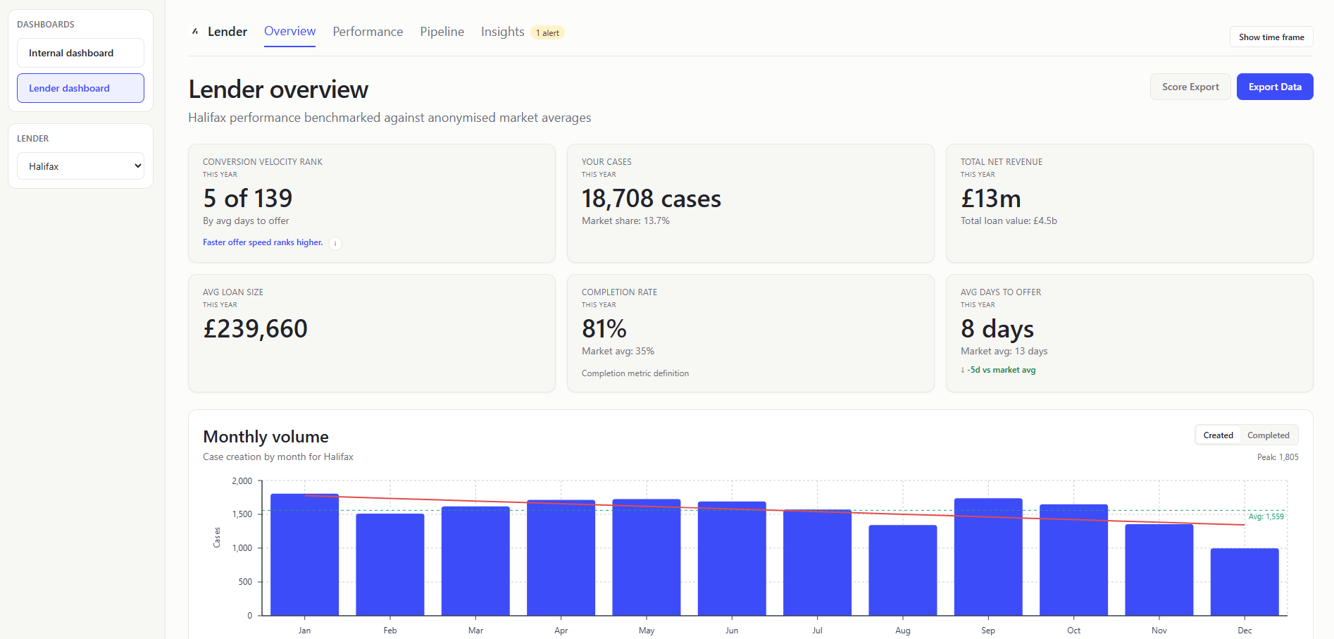
CONVERSION VELOCITY RANK (KPI Card)
- What it shows: Position among lenders by average days-to-offer (
firstSubmittedDatetocompletionDate), including (with minimum-volume eligibility >= 5). - Value to user: Lenders get context beyond absolute days and how they compare to the market.
YOUR CASES (KPI Card)
- What it shows: How many cases you have, with your completion market share as context. Market share based on lender completed cases vs market completed cases.
- Value to user: Keeps the most actionable quantity (case volume) prominent while preserving share context.
TOTAL NET REVENUE (KPI Card)
- What it shows: Sum of lender
netCaseRevenuevalues, withTotal loan valueshown. - Value to user: Surfaces commercial outcome and lending scale together without requiring a separate panel.
AVG LOAN SIZE (KPI Card)
- What it shows: Typical loan size for your submitted business.
- Value to user: Lenders can understand portfolio value profile.
COMPLETION RATE (KPI Card)
- What it shows: What portion of your cases finish, and how that compares. Lender completed cases / lender total cases; compare to market equivalent.
- Value to user: Lenders can benchmark operational effectiveness directly.
AVG DAYS TO OFFER (KPI Card)
- What it shows: How fast you convert submissions into offers. Average day difference using
firstSubmittedDate -> firstOfferDateonly (rows must have both dates). - Value to user: Lenders can quantify speed competitiveness, a key broker decision factor.
MONTHLY VOLUME (Chart)
- What it shows: Your monthly case trend, with the option to switch between case creation (createdAt) and case completions (completionDate).
- Value to user: Lenders can separate pipeline generation trend from actual completion throughput.
PIPELINE FUNNEL (Chart)
Show the same as the Internal Dashboard Pipeline Funnel, but scoped to the selected lender rows only.
STAGE DISTRIBUTION (Chart)
Show the same as the Internal Dashboard Stage Distribution, but scoped to the selected lender rows only.
YOUR CASE MIX VS MARKET (Chart)
- What it shows: Case-type distribution comparison between lender and market.
- Value to user: Lenders can identify segment over/under-indexing and which cases they are most popular or least popular.
PERFORMANCE BENCHMARKS TABLE (Table)
- What it shows: Side-by-side lender vs market metrics (LTV, revenue/case, protection attach, days to complete, resubmission). Quick scorecard of where you are above or below market.
- Value to user: Lenders can prioritize improvements on weakest dimensions.
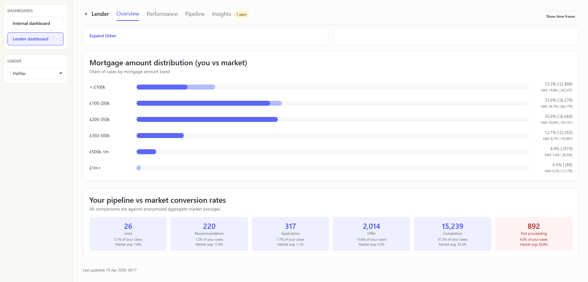
MORTGAGE AMOUNT DISTRIBUTION (YOU VS MARKET) (Chart)
- What it shows: Whether your loan-size mix is weighted smaller or larger than market.
- Value to user: Lenders can spot under-indexed loan-size bands and adjust acquisition/pricing focus.
YOUR PIPELINE VS MARKET CONVERSION RATES (Table)
- What it shows: Stage cards for all pipeline stages including
NOT_PROCEEDING, with lender volume and lender/market stage share. Stage count from status-to-stage pipeline mapping; stage share = stage count / total included cases after excluding system statuses with no mapped stage. - Value to user: Lenders can isolate stage-level volume and share gaps without crowded inline labels.
Performance
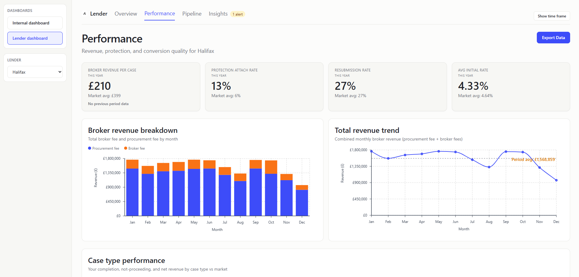
BROKER REVENUE PER CASE (KPI Card)
- What it shows: Average Broker fees per case. Sum lender
totalBrokerFees/ lender case count and then compare to market and previous period. Inlcudes 0 values which is why it is low. - Value to user: Lenders see commercial efficiency and trajectory.
PROTECTION ATTACH RATE (KPI Card)
- What it shows: How often protection products are attached to your cases.
linkedProtectiontrue count / lender case count. - Value to user: Lenders can assess cross-sell performance against peers.
RESUBMISSION RATE (KPI Card)
- What it shows: How often cases need to be submitted again.
- Value to user: Lenders can identify process friction and quality issues.
AVG INITIAL RATE (KPI Card)
- What it shows: Average
initialPayRate, with market benchmark. - Value to user: Lenders can compare pricing profile against platform baseline.
BROKER REVENUE BREAKDOWN (MONTHLY STACKED BAR) (Chart)
- What it shows: Monthly split of broker fee vs procurement fee totals. Group by month, sum
totalBrokerFeesandgrossMortgageProcFee. - Value to user: Lenders can understand composition changes in earnings.
TOTAL REVENUE TREND (Chart)
- What it shows: Monthly total revenue line with period average reference. In plain terms: Whether revenue is tracking above or below normal.
- How it is calculated: Monthly total = broker fee + proc fee; average line from monthly mean.
- Value to user: Lenders can monitor momentum and detect weak months early.
These two charts are showing near identical data with some slight differences in the data - but they could be combined into a single chart.
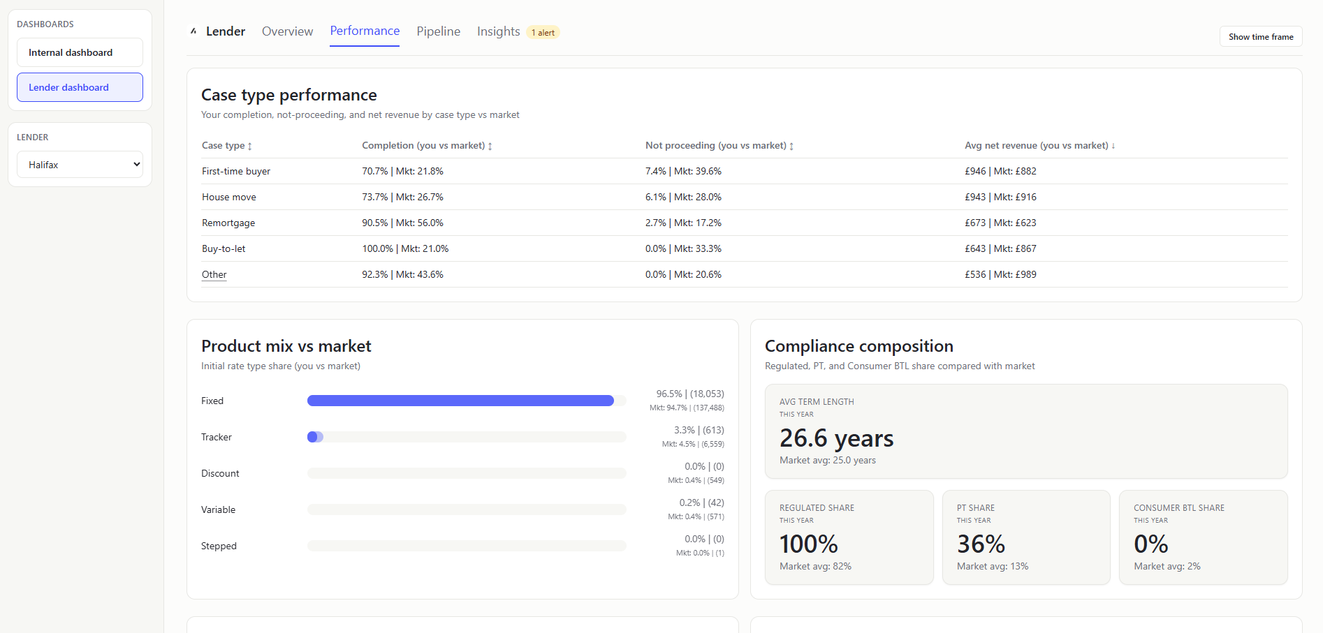
CASE TYPE PERFORMANCE (Table)
- What it shows: Case-type comparison table for lender vs market across completion rate, not-proceeding rate, and average net revenue. Which case types outperform or underperform market quality and economics.
- Value to user: Lenders can target operational/commercial interventions by case type.
PRODUCT MIX VS MARKET (Chart)
- What it shows: Initial-rate-type share comparison (fixed, tracker, discount, variable, stepped) for lender vs market. How your rate-product composition differs from platform baseline. Excludes blank values.
- Value to user: Lenders can identify product-mix gaps against market demand.
COMPLIANCE COMPOSITION (Mini-KPI Row)
- What it shows: Mini-KPIs for regulated share, product-transfer share, and consumer-BTL share, each with market benchmark; includes avg term length KPI. A quick compliance/profile snapshot of your case book vs market.
- Value to user: Lenders can quickly monitor compliance-heavy mix changes and compare against market norm.
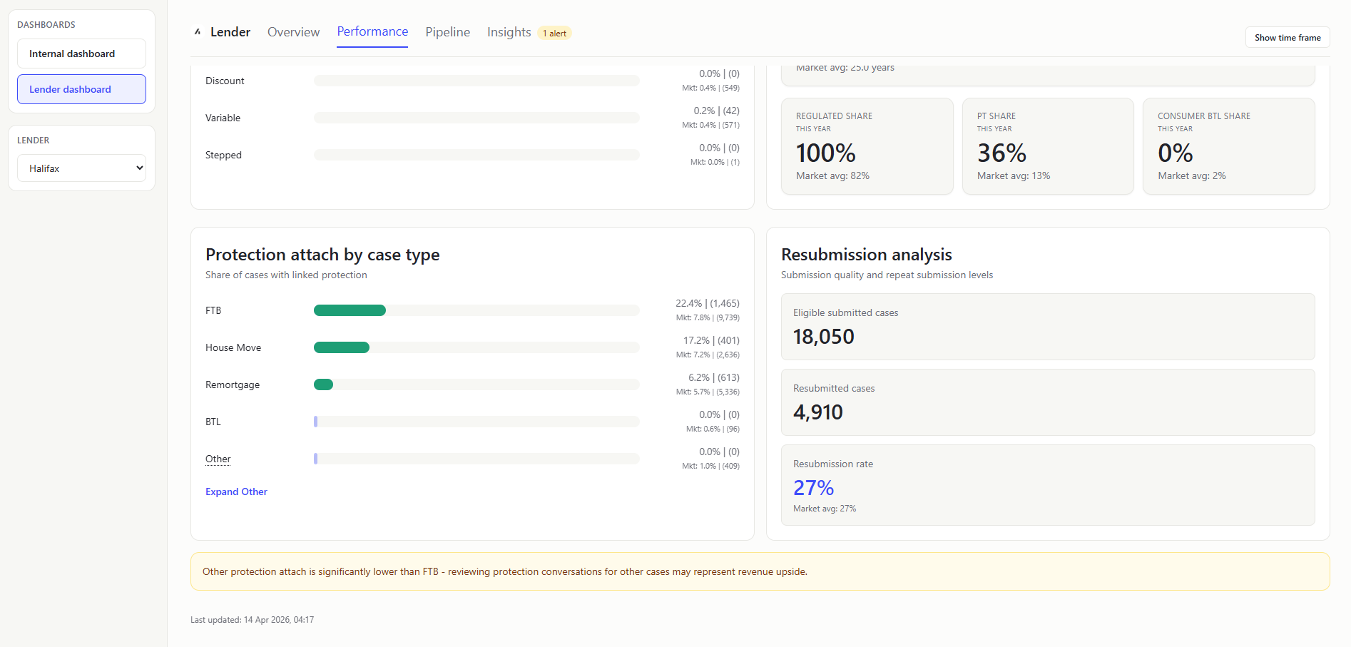
PROTECTION ATTACH BY CASE TYPE (Chart)
- What it shows: Protection attach rates segmented by case type. Which case types convert best for protection.
- Value to user: Lenders can target commercial improvements by segment and immediately spot over/under-performance visually.
RESUBMISSION ANALYSIS PANEL (Table)
- What it shows: Eligible submitted count, resubmitted count, and resulting rate (with market baseline).
- Value to user: Lenders can judge if percentage movement is material or sample-size noise.
Pipeline
SUBMISSION TO OFFER SPEED (KPI Card)
- What it shows: Mean submission-to-offer cycle time (
firstSubmittedDatetofirstOfferDate) vs market benchmark and rank cue. How quickly your submitted cases get to offer. - Value to user: Lenders can track a core turnaround metric that impacts broker choice.
OFFER TO COMPLETE SPEED (KPI Card)
- What it shows: Mean offer-to-completion duration (
firstOfferDatetocompletionDate) vs market. How long completion takes after an offer is received. - Value to user: Lenders can isolate post-offer processing efficiency.
NOT PROCEEDING RATE (KPI Card)
- What it shows: Share of lender rows in
NOT_PROCEEDING, with market comparison. - Value to user: Lenders can monitor attrition risk and benchmark leakage.
PIPELINE FUNNEL (Chart)
Show the same as the Internal Dashboard Pipeline Funnel, but scoped to the selected lender rows only.
STAGE DISTRIBUTION (Chart)
Show the same as the Internal Dashboard Stage Distribution, but scoped to the selected lender rows only.
DROP-OFF REASONS (Table)
- What it shows: Top grouped reasons for lender not-proceeding cases, shown in an internal-overview-style table with market comparison bars and a recommendation column. Revenue at risk is
totalCaseRevenuefor the not-proceeding cases. - Value to user: Lenders can prioritize process/product changes with highest loss impact.
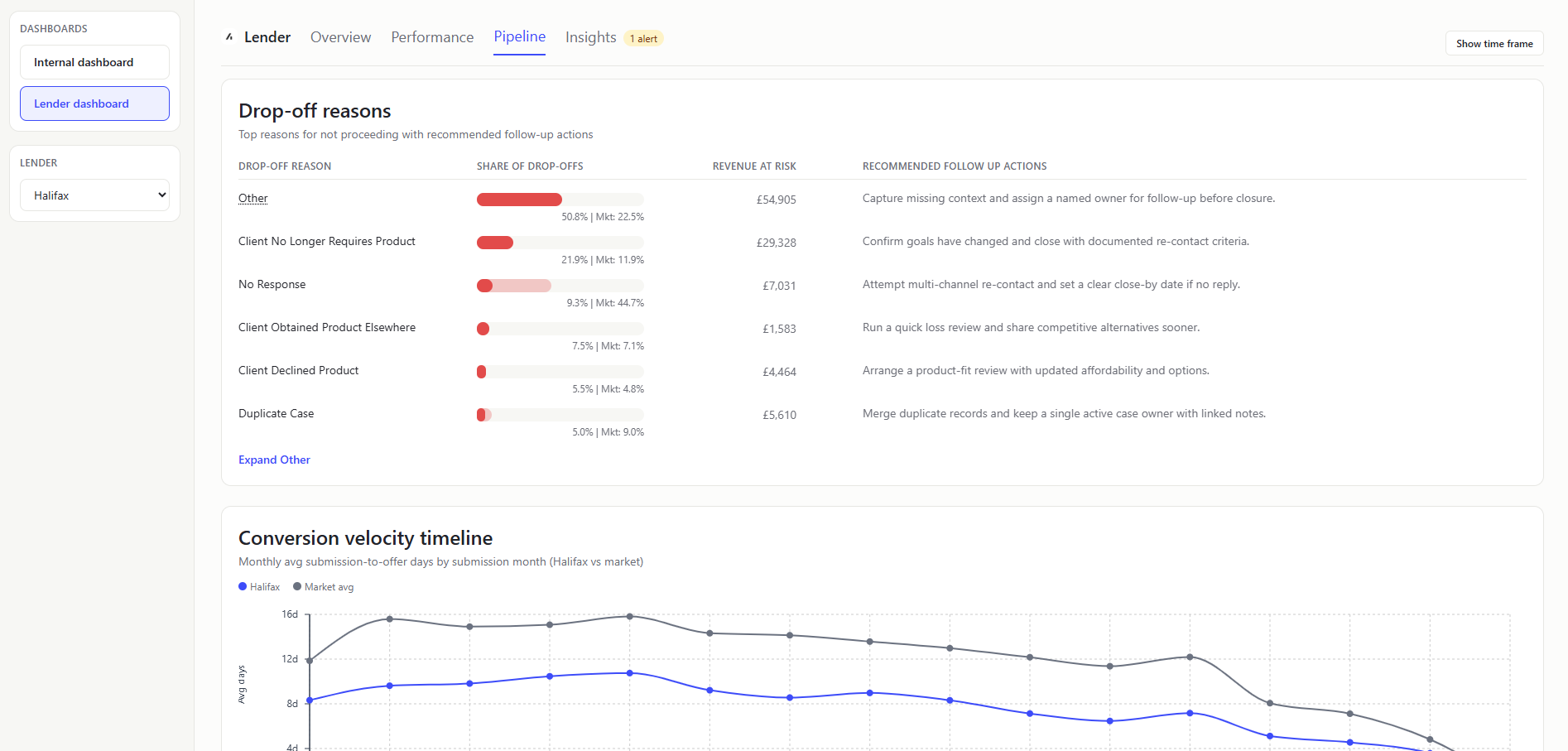
CONVERSION VELOCITY TIMELINE (Chart)
- What it shows: Dual-line monthly trend of average submission-to-offer days (
firstSubmittedDatetofirstOfferDate) for lender and market. Whether your offer speed trend is improving or diverging from market over time. - Value to user: Lenders can track month-by-month speed competitiveness, not just period averages.
This chart is showing values in April 2026 as some of the firstSubmittedDate sit in 2026.
The maths behind this graph clamps to 0 for data errors (such as months where no rows have both required dates) which is why you see the 0 values.
For recent submission months (especially 2026), many slower cases likely haven’t reached offer yet, so they’re excluded. That leaves a biased sample of faster-converting cases, which pushes the average days down.
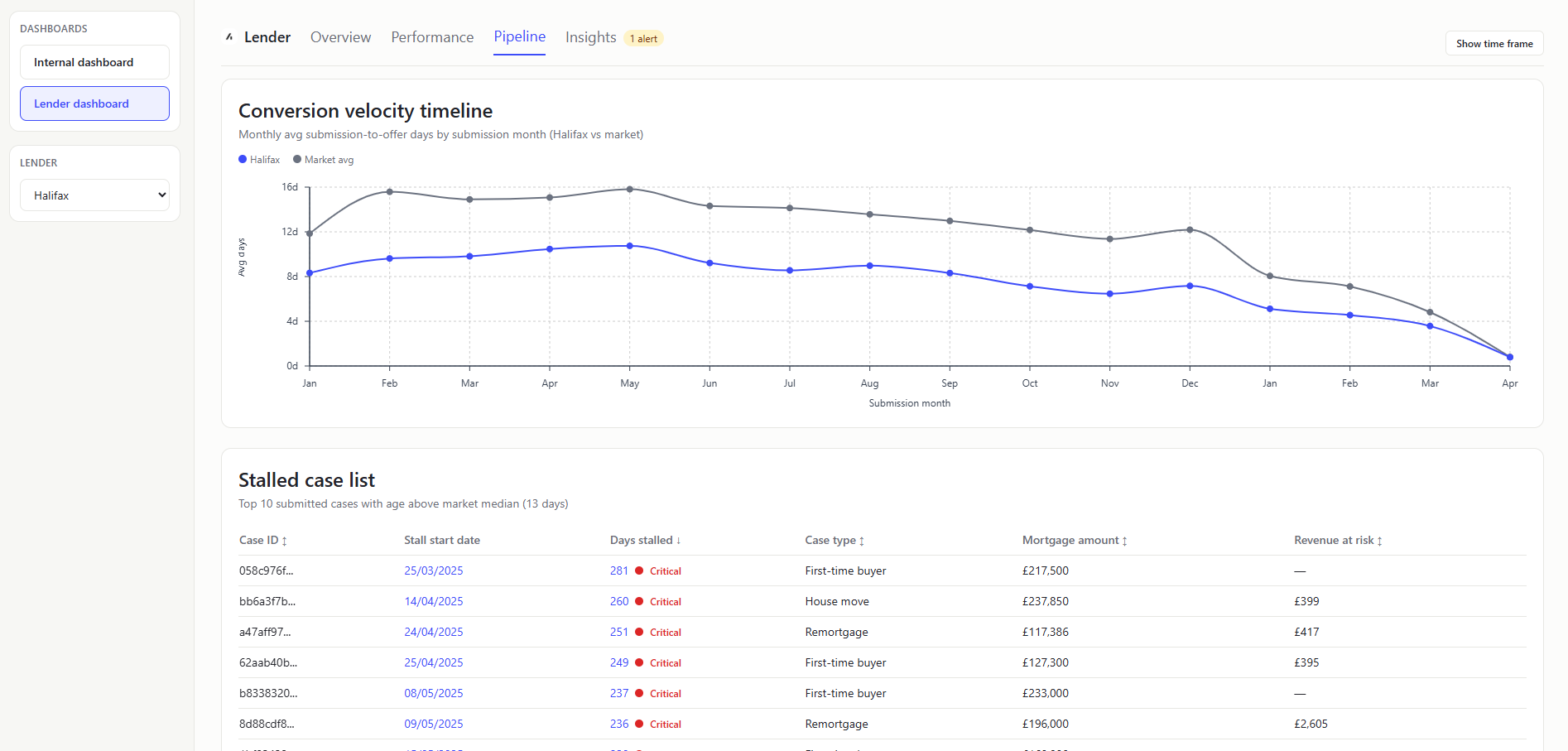
STALLED CASE LIST (Table)
- What it shows: Application-stage cases stalled (where
lastSubmittedDateorfirstSubmittedDateis before the report as-of date) beyond market-derived threshold, with stall start date, days stalled, case type, mortgage amount, and revenue at risk (netCaseRevenue). - How it is calculated: Keep
APPLICATION-stage rows, compute age fromlastSubmittedDate ?? firstSubmittedDateto the report as-of date, and filter rows abovemax(1, round(market avg days to offer)). - Value to user: Lenders can convert analysis into immediate case-level follow-up.
A stalled case is a case that is still in the APPLICATION stage and has been stalled for more than the market average submission-to-offer days (lastSubmittedDate or firstSubmittedDate is before the report as-of date).
Insights
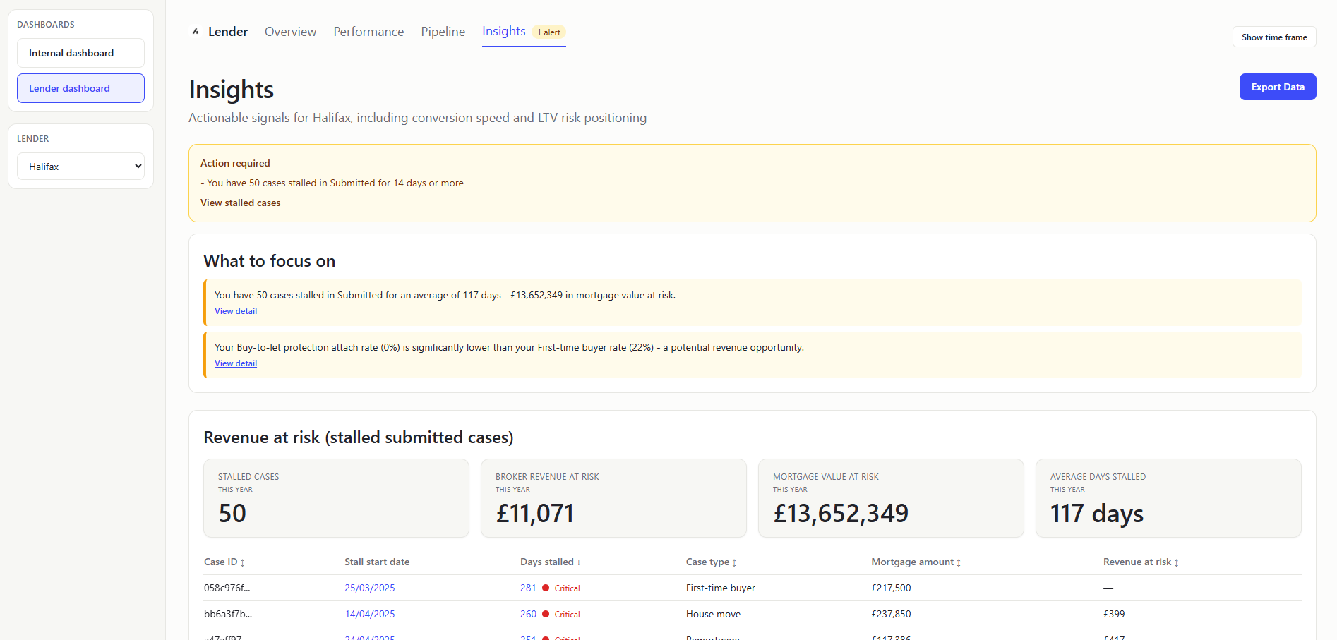
HIGH FURTHER ADVANCES BADGE (Header pill)
- What it shows: Amber
High further advancesbadge below the Insights page header when selected lender further-advance share is elevated. that a large proportion of current cases are additional borrowing against existing mortgages (over 20% of cases). - Value to user: Surfaces product-mix risk/opportunity immediately before deeper analysis.
ACTION REQUIRED ALERTS (Table)
- What it shows: Rule-based alert messages from
evaluateLenderInsights. Priority warning signals that need attention now. - All current alert types:
You have {n} cases stalled in Submitted for over {threshold} days- Trigger: at least one submitted case exceedsround(market avg days to offer))Submission-to-offer speed is slower than market average- Trigger: lender average submitted-to-offer days > market average.Not-proceeding rate is above market average- Trigger: lender not-proceeding share > market not-proceeding share.
- Value to user: Lenders get concise, actionable guidance without scanning every chart.
WHAT TO FOCUS ON (Table)
- What it shows: Top recommendation cards generated by insights evaluation logic.
- All current possible recommendation items (max 3 shown at once):
You have {n} cases stalled in Submitted for an average of {d} days - £{value} in mortgage value at risk.- Trigger: at least one submitted case exceeds the stall threshold.Your not-proceeding rate ({x}%) is above the market average ({y}%) - review top drop-off reasons below.- Trigger: lender not-proceeding share is above market not-proceeding share.Your {lowestType} protection attach rate ({x}%) is significantly lower than your {highestType} rate ({y}%) - a potential revenue opportunity.- Trigger: lowest case-type attach rate is less than half of highest attach rate.Your submission-to-offer speed ({x} days) is slower than the market average ({y} days).- Trigger: lender average submitted-to-offer days is above market average.Your resubmission rate ({x}%) is above the market average ({y}%) - first-submission quality may be improvable.- Trigger: lender resubmission rate is greater than market rate by more than 5%.
- Value to user: Lenders get prescriptive next steps, not just descriptive analytics.
STALLED CASES (KPI Card)
- What it shows: Count of stalled submitted cases in insights section.
- Value to user: Lenders can size operational backlog quickly.
A stalled case is a case that is still in the APPLICATION stage and has been stalled for more than the market average submission-to-offer days (lastSubmittedDate or firstSubmittedDate is before the report as-of date).
BROKER REVENUE AT RISK (KPI Card)
- What it shows: Sum of
totalCaseRevenuefor stalled cases. - Value to user: Lenders can prioritize operational work by commercial impact.
MORTGAGE VALUE AT RISK (KPI Card)
- What it shows: Sum of
mortgageAmountfor stalled cases. - Value to user: Lenders can understand scale of potential lost lending volume.
AVERAGE DAYS STALLED (KPI Card)
- What it shows: Mean stall age for stalled-case subset. Days between
lastSubmittedDateorfirstSubmittedDateand the report as-of date. - Value to user: Lenders can prioritize whether issue is broad/early or deep/long-running.
REVENUE-AT-RISK CASE TABLE (Table)
Same as the Stalled case list table.
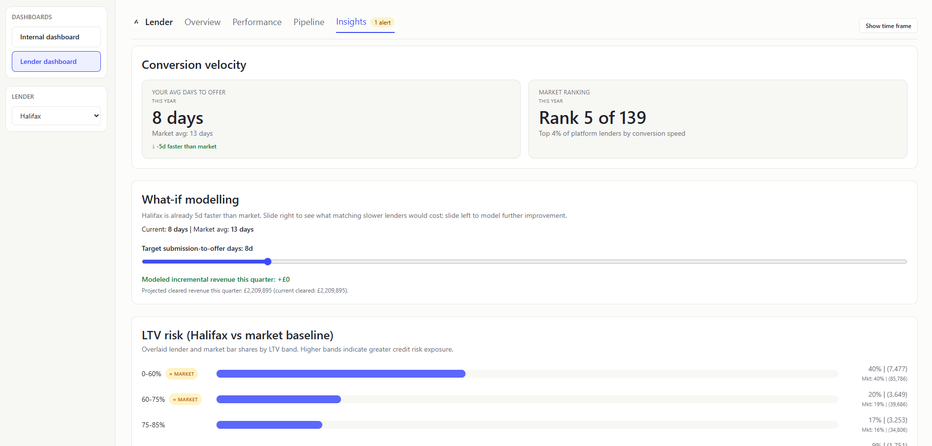
CONVERSION VELOCITY SECTION (KPI Card)
- What it shows: Two KPI cards: lender avg days-to-offer (
firstSubmittedDatetofirstOfferDate) vs market benchmark and rank cue. How quickly your submitted cases get to offer. - Value to user: Lenders can judge competitiveness in a broker-sensitive metric.
WHAT-IF MODELLING (Section)
- What it shows: Interactive target-days slider for submission-to-offer days (
firstSubmittedDatetofirstOfferDate) speed with live modelled incremental revenue (totalCaseRevenue) this quarter. A quick scenario test for “if we got faster, how much extra revenue could clear this quarter?” - How it is calculated: Uses current lender speed, market average speed, and in-flight revenue in the latest creation quarter; applies a proportional improvement heuristic from current rounded speed to selected target days to estimate incremental cleared revenue and projected quarter total.
- Value to user: Lenders can connect operational speed improvements to commercial impact in real time.
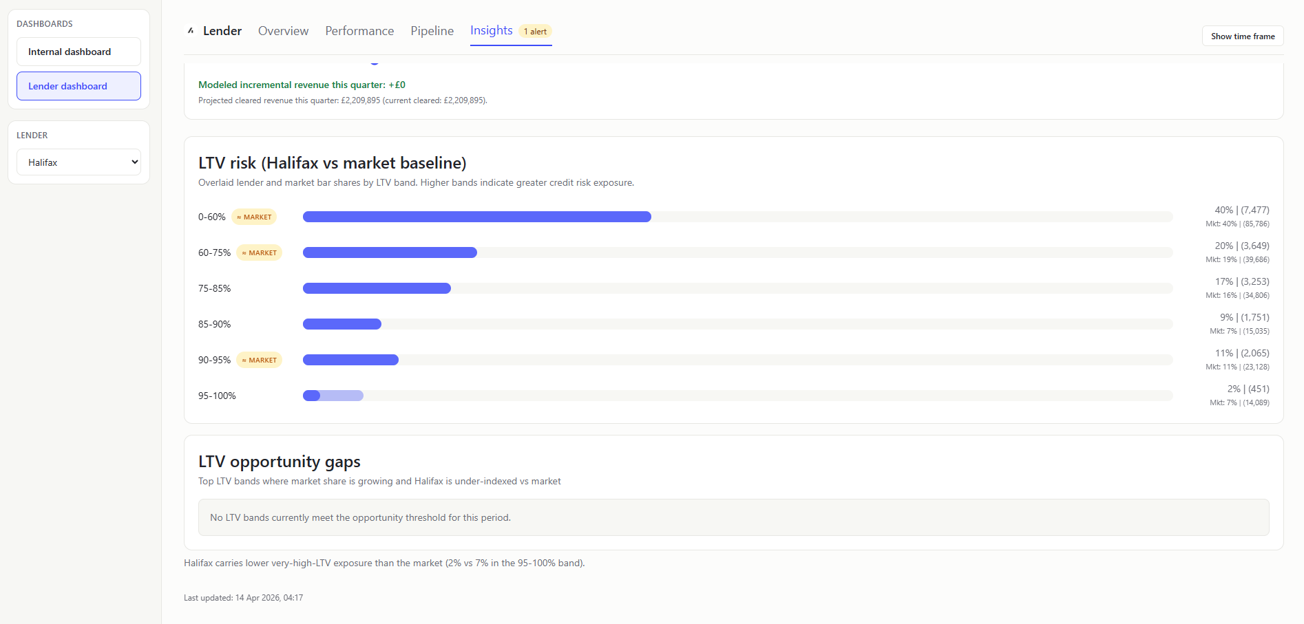
LTV RISK (LENDER + MARKET BASELINE) (Chart)
- What it shows: Single combined chart with overlaid transparent bars for lender and market baseline by LTV band. In plain terms: Whether your risk profile is heavier or lighter than market.
- Value to user: Lenders can evaluate credit-risk positioning relative to peers.
The LTV band "95-100%" includes all values above 95% up to the 1.5 LTV cap.
LTV OPPORTUNITY GAPS (Callout Card)
- What it shows: Top two LTV bands where market share growth is positive period-over-period and lender share is below market share. In plain terms: Highest-priority LTV bands where you are under-indexed while demand is growing.
- How it is calculated: Compare current-period market band shares vs prior equivalent period; filter to
marketGrowthRate > 0andlenderShare < marketShare; rank by combined growth-and-gap opportunity score. - Value to user: Focuses attention on capture opportunities instead of only risk exposure.
Mortgage Data Dictionary
A plain-English guide to every column in mortgage.csv and the mortgage concepts they represent.
A mortgage is a loan secured against a property. A borrower (the person buying or remortgaging) works with a broker (an adviser who finds them the best deal) to apply to a lender (the bank or building society providing the money). Acre is the technology platform that brokers use to manage this process.
Each row in the CSV represents one mortgage case - a single application journey from initial enquiry through to completion (or abandonment).
Money values in this dataset are stored in pence (i.e. multiply by 100 from pounds). A mortgage_amount of 19550000 means £195,500.
Identity and relationship fields
| Column | What it means |
|---|---|
org_id | The brokerage firm using Acre. Each firm has multiple advisers. |
advisor_id | The individual mortgage adviser handling this case. |
introducer_id | An external party (e.g. estate agent, accountant) who referred the client to the broker. |
internal_referer_id | An internal team member who passed this case to the adviser (nullable - not always used). |
internal_referer | Display name or reference for the internal referrer. |
case_administrator_id | Support staff member assigned to handle the admin for this case. |
case_manager_id | A senior person overseeing the case (different from the adviser). |
case_id | Unique identifier for this mortgage case. This is the primary key. |
Time fields
| Column | What it means |
|---|---|
created_year | Year the case was created (e.g. 2025). |
created_month | Month number (1-12). |
created_week | ISO week number (1-52). |
created_at | Full timestamp when the case was first created on Acre. |
Case classification
| Column | What it means |
|---|---|
case_type | Why the client needs a mortgage. Key values: REASON_FTB (first-time buyer - never owned before), REASON_REMORTGAGE (switching lender or deal on an existing property), REASON_HOUSE_MOVE (moving to a new property), REASON_BTL (buy-to-let - purchasing to rent out). |
regulated | Whether this mortgage falls under FCA regulation. t = yes (most residential mortgages), f = no (some commercial/BTL cases). The FCA is the UK's financial regulator. |
consumer_btl | Whether this is a "consumer buy-to-let" - a special category where the landlord is an accidental one (e.g. inherited a property). These still get consumer protections. |
further_advance | t if the borrower is borrowing additional money from their existing lender on top of what they already owe, rather than taking a brand new mortgage. |
pt | Product transfer - t if the borrower is staying with their current lender but moving to a new rate/deal. No new application needed, just switching products. Quicker and simpler than a full remortgage. |
porting | t if the borrower is transferring their existing mortgage deal to a new property. Like taking your phone contract to a new handset - same deal, different property. |
charge_priority | The legal priority of this mortgage against the property. A first charge (1) means this lender gets paid first if the property is sold. A second charge (2) means another lender has first dibs. Most mortgages are first charge. |
Pipeline and status
| Column | What it means |
|---|---|
case_status | Where this case sits in the pipeline. This is the funnel you will visualise. Values in order: LEAD (initial enquiry, no advice given yet) → PRE_RECOMMENDATION (adviser is researching options) → APPLICATION_SUBMITTED (formal application sent to lender) → OFFER_RECEIVED (lender has approved and issued an offer) → COMPLETE (mortgage has drawn down, keys handed over) → NOT_PROCEEDING (case was abandoned at some point). |
mortgage_status | A secondary status specific to the mortgage product selection. STATUS_SELECTED means a product has been chosen. Often empty for early-stage or abandoned cases. |
linked_protection | t if the broker also sold an insurance product (life insurance, critical illness cover, etc.) alongside this mortgage. This is a key revenue metric for brokers. |
Financial fields
All monetary values are in pence. Divide by 100 to get pounds.
| Column | What it means |
|---|---|
mortgage_amount | The total amount being borrowed (in pence). |
interest_only_amount | How much of the mortgage is on an interest-only basis (borrower only pays interest each month, doesn't reduce the loan). The rest would be "repayment" (paying off the loan gradually). |
fees_added_to_loan | Any fees (arrangement fees, broker fees) that have been added to the mortgage balance instead of being paid upfront. This means the borrower pays interest on them too. |
property_value | The value of the property being mortgaged (in pence). |
term | How long the mortgage lasts. |
term_unit | The unit for the term field - typically TERM_MONTHS (e.g. 300 = 25 years). |
n_clients | Number of borrowers on this mortgage - 1 for a solo buyer, 2 for a joint application (e.g. a couple). |
ltv | Loan-to-value ratio. The mortgage amount divided by the property value. An LTV of 0.85 means the borrower is borrowing 85% of the property's value (so they have a 15% deposit). Lower LTV = less risky for the lender = better interest rates. Key thresholds: 60%, 75%, 80%, 85%, 90%, 95%. |
Revenue fields
These track how the brokerage firm earns money from each case. All in pence.
| Column | What it means |
|---|---|
total_broker_fees | Fees the client pays directly to the broker for advice. |
gross_mortgage_proc_fee | Procurement fee (gross) - a commission the lender pays the broker for bringing them the business. This is the headline amount before any network takes their cut. |
net_mortgage_proc_fee | The procurement fee after the broker network or club has taken their share. |
other_fees | Any other fees associated with the case. |
total_case_revenue | Total income from this case (broker fees + procurement fees + other). |
net_case_revenue | Revenue after deductions. |
total_case_payments | How much has actually been paid out so far. |
Product details
These describe the specific mortgage product the borrower has been placed on.
| Column | What it means |
|---|---|
initial_rate_end_date | When the introductory interest rate expires. After this, the borrower typically moves to the lender's standard variable rate (SVR) which is much higher - this is when most people remortgage. |
initial_pay_rate | The interest rate during the introductory period, stored as basis points or a raw number. E.g. 454000 likely represents 4.54%. Check the data to confirm scaling. |
initial_rate_type | The type of interest rate: CLASS_FIXED (rate locked for the initial period - most common and popular), CLASS_TRACKER (rate follows the Bank of England base rate plus a margin), CLASS_DISCOUNT (a discount off the lender's SVR), CLASS_VARIABLE (can change at the lender's discretion). |
Lender fields
| Column | What it means |
|---|---|
lender_id | Unique identifier for the lender. |
lender | Human-readable lender name (e.g. "Halifax", "Barclays Bank", "Santander UK Plc"). |
prev_lender | The lender the borrower was with previously - only relevant for remortgages and product transfers. Useful for analysing lender retention and switching patterns. |
club_name | The mortgage club or network the broker belongs to (e.g. "Right Mortgage Network", "PMS"). These are buying groups that negotiate better commission rates with lenders. |
Lifecycle dates
These timestamps track the case through each stage. The gaps between them reveal processing speed and bottlenecks.
| Column | What it means |
|---|---|
recommendation_date | When the adviser formally recommended a product to the client. |
first_submitted_date | When the application was first submitted to the lender. |
last_submitted_date | The most recent submission date - differs from first_submitted_date if the case was resubmitted (e.g. after a rejection or correction). |
first_offer_date | When the lender first issued a mortgage offer. |
last_offer_date | Most recent offer date - may differ if the offer was reissued. |
completion_date | When the mortgage completed - money transferred, keys handed over. This is the finish line. |
not_proceeding_date | When the case was marked as abandoned. |
not_proceeding_reason | Why the case fell through. Values include: NO_RESPONSE (client went silent), CLIENT_DECLINED_PRODUCT (client didn't like the options), INCORRECT_CONTACT_DETAILS (couldn't reach them), OTHER. |
first_exchange_date | When contracts were first exchanged (in a house purchase, exchange is the legally binding commitment). |
last_exchange_date | Most recent exchange date. |
Key calculations you can derive
- Conversion rate - what percentage of cases at stage X progress to stage Y
- Pipeline velocity - average days between lifecycle dates (e.g. submission to offer)
- Lender market share - proportion of completed cases per lender
- Average deal size - mean mortgage amount by case type or lender
- LTV distribution - risk profile across the book
- Revenue per case - total revenue divided by completed cases
- Protection attachment rate - percentage of cases with
linked_protection = t - Drop-off analysis - where in the funnel cases are being lost, and why
User Stories
Acre Internal Users
AI-01 As an Acre Account Manager, I want to see completed case volume and total loan value ranked by lender, so that I can identify which lender partnerships are driving the most platform activity and prioritise my relationship management accordingly.
AI-02 As an Acre Product Manager, I want to see a breakdown of case volumes by case type (first-time buyer, remortgage, house move, buy-to-let), so that I can align product development priorities to the most common customer journeys on the platform.
AI-03 As an Acre Platform Analyst, I want to see funnel conversion rates at each pipeline stage (Lead → Recommendation → Application → Offer → Complete), so that I can establish a platform-wide benchmark for what good conversion performance looks like across lenders.
AI-04 As an Acre Operations Lead, I want to view case creation and completion volumes aggregated by week and by month across all lenders, so that I can identify seasonal patterns or unexpected drops in activity that may warrant operational intervention.
AI-05 As an Acre Platform Analyst, I want to see which case types have the highest completion rate and which have the highest rate of not proceeding, so that I can investigate where friction exists in the process and surface improvement opportunities to the product team.
AI-06 As an Acre Platform Analyst, I want to see the platform-wide average number of days from submission to offer, and from submission to completion, for a given period, so that I can track overall processing efficiency and set market benchmarks for lender performance reviews.
AI-07 As an Acre Platform Analyst, I want to see a breakdown of cases by initial rate type (fixed, tracker, discount, variable) and by average mortgage term length for a given period, so that I can understand which products are most prevalent across the platform and identify shifts in the product mix over time.
AI-08 As an Acre Platform Analyst, I want to see average net case revenue broken down by case type, so that I can identify which case types are the most commercially valuable to the platform and inform prioritisation decisions.
AI-09 As an Acre Finance Analyst, I want to see total broker fees, gross and net procurement fees, and net case revenue aggregated across the platform for a selectable time period, so that I can produce accurate commercial performance reports for internal and board-level stakeholders.
AI-10 As an Acre Platform Analyst, I want to see the total number and proportion of cases that are FCA-regulated for a given period, so that I can ensure our compliance reporting obligations are met and flag any anomalies to the compliance team.
AI-11 As an Acre Platform Analyst, I want to see the volume and proportion of cases flagged as product transfers, consumer buy-to-let, further advances, and porting cases respectively, so that I can understand the composition of our case book and correctly exclude or segment these case types in pipeline and conversion analysis.
AI-12 As an Acre Platform Analyst, I want to see how many completed mortgage cases have an associated linked protection product, so that I can track protection penetration across the platform and support cross-sell performance reporting.
AI-13 As any authenticated user, I want to filter all dashboard views by a custom date range (defaulting to the current calendar year), so that I can analyse performance for any specific period without being constrained to a fixed time window.
AI-14 As an Acre Platform Analyst, I want to see a ranked breakdown of not-proceeding reasons across all cases on the platform for a given period, so that I can identify the most common causes of case loss and share systemic findings with lender partners.
AI-15 As an Acre Platform Analyst, I want to see case volumes and completion rates segmented by club or network affiliation, so that I can understand which distribution channels are most active on the platform and identify partnership opportunities.
Lender Partners
LP-01 As a Lender Product Manager, I want to see my total completed case volume, total loan value, and net revenue for a selected time period, so that I can assess our overall performance on the platform at a glance.
LP-02 As a Lender Product Manager, I want to see my average net revenue per case compared to the platform-wide average, so that I can understand whether my cases are generating above- or below-average commercial value relative to the broader market.
LP-03 As a Lender Product Manager, I want to see net revenue broken down by case type for my lender versus the platform average, so that I can identify which case types are most profitable for us and where we may be underperforming the market commercially.
LP-04 As a Lender Product Manager, I want to understand the reasons why cases with my lender are not proceeding, compared to the distribution of not-proceeding reasons across the platform, so that I can identify whether specific process or product issues are driving avoidable case loss.
LP-05 As a Lender Risk Officer, I want to see the distribution of LTV ratios across my active and completed case book, segmented into standard risk bands (< 60%, 60–75%, 75–85%, 85–95%, 95%+), benchmarked against the platform-wide distribution, so that I can assess whether our portfolio is concentrating in higher-risk lending relative to the market.
LP-06 As a Lender Product Designer, I want to see the LTV bands where platform-wide case volume is growing but my lender's share is low, so that I can identify product or pricing gaps and adjust our rate strategy to capture that missing volume.
LP-07 As a Lender Business Development Manager, I want to see my completed case volume, average LTV, and average mortgage amount benchmarked against the platform-wide averages, so that I can quickly identify whether we are over- or under-indexing in any area relative to our competitors.
LP-08 As a Lender Product Manager, I want to see our average number of days from submission to offer, and from submission to completion, for a given period benchmarked against the platform average, so that I can monitor our processing efficiency and track improvements over time.
LP-09 As a Lender Operations Manager and Lender Underwriting Manager, I want to see a timeline comparison of our average days between submission and offer versus the platform average, broken down by month, so that I can identify whether our internal processes are creating delays that risk losing brokers to faster competitors.
LP-10 As a Lender Business Development Manager, I want to see cases currently sitting in "Application Submitted" or "Awaiting Offer" that have already exceeded the platform-average dwell time for that stage, so that I can proactively flag them for follow-up and reduce the risk of those cases not proceeding.
LP-11 As a Lender Product Manager, I want to see a time-based trend of my case creation and completion volumes by week or month, so that I can identify whether our platform activity is growing, declining, or seasonal compared to overall market trends.
LP-12 As a Lender Product Manager, I want to see a breakdown of my completed cases by initial rate type (fixed, tracker, discount, variable) and average term length, benchmarked against the platform-wide distribution, so that I can understand whether brokers are recommending our products in line with - or against - broader market demand, and adjust our product strategy accordingly.
LP-13 As a Lender Product Manager, I want to see the volume and proportion of my cases that are FCA-regulated and those that are product transfers, so that I can accurately segment our case book for compliance reporting and ensure product transfer cases are excluded from full pipeline analysis where appropriate.
LP-14 As a Lender Risk Officer, I want to see the distribution of mortgage amounts across my case book compared to the platform-wide distribution, so that I can assess whether we are over-exposed to high-value lending or missing volume in lower-value segments.
LP-15 As a Lender Product Manager, I want to export any dashboard view as a CSV or PDF, so that I can share performance data with internal stakeholders who do not have access to the dashboard.